From Ambiguity to Fluidity:
A Case Study in Game Usability
ROLE
UX/UI Designer
TIMELINE
2023
.png)
From Complexity to Conquest
The Challenge of Uniting Two Worlds
Designing the experience of a tactical RPG like Cybersteam Heroes was more than just building an interface, it was about reconciling the needs of two distinct player groups.
On one side, novice players, easily overwhelmed by the system’s complexity. On the other, veteran players, demanding strategic depth and full control.
The real battlefield was not only inside the game’s combat mechanics, but within its usability, the critical link that could turn frustration into engagement and unite both audiences.
Our mission was to move beyond designing for a single profile. We aimed for a solution that was flexible, scalable, and inclusive, guiding beginners without restricting experts. To achieve this, we adopted a player-centered approach, transforming behavioral insights into strategic design decisions that balanced accessibility with depth.
To comply with my non-disclosure agreement, I have omitted and obfuscated confidential information in this case study.
Identifying the Problem
The Burden of Ambiguity
The project’s greatest obstacle wasn’t a lack of features, it was ambiguity.
While the interface was manageable for players already familiar with the genre, it became an impenetrable barrier for newcomers. This friction surfaced most clearly during onboarding, where we observed:
25%
Dropout rates for new players during testing sessions, with more than 25% of participants giving up after the first few missions.
58%
Volume of recurring questions within our test base, which cost time and resources for the QA team.
The issue was not that the system was hard. It was that the design was unclear, imposing unnecessary cognitive load. Instead of focusing on the excitement of tactical combat, new players spent their first hours simply trying to decode the interface.
This misalignment highlighted a strategic tension: how to reduce friction for beginners without diluting the complexity that veterans valued. To uncover the roots of this problem, and validate whether ambiguity was the true culprit, we initiated an in-depth discovery phase, mapping the hidden journey of the player.
Reduce friction for novices: Simplify the onboarding and combat experience.
HIGH-LEVEL
GOALS
Empower expert players: Maintain the depth and complexity that veteran players demanded.
Create a sustainable design: Build a foundation that scales with the player's evolution.
My Role
As the UX/UI Designer on Cybersteam Heroes, my role spanned from initial concept definition to iterative validation. Beyond delivering screens, I shaped the strategic design direction of the project, ensuring usability served as the bridge between accessibility and depth.
-
User Research & Insights – Designed and executed research plans combining interviews, usability tests, and player journey mapping. Synthesized findings into actionable frameworks that prioritized reducing onboarding friction while preserving advanced mechanics.
-
Design Strategy & Prototyping – Translated insights into scalable solutions through low to high-fidelity prototypes. Explored multiple design directions, validated trade-offs with users, and iterated toward an interface that adapted to player progression.
-
Stakeholder Alignment – Facilitated cross-functional workshops with designers, developers, and QA. Aligned the team around a shared vision of usability, mediating between business goals and player experience.
-
Product Architecture – Defined an information architecture that grew with the player’s evolution. Established a foundation for a modular interface and reusable patterns, anticipating future scalability of the system.
Uncovering the Hidden Journey of the Player
To move beyond assumptions and validate our hypotheses, we designed a multi-method research plan. The goal was to uncover not just what players struggled with, but why.

Our discovery was structured into four complementary methods.
Usability Tests
We conducted usability tests with 20 participants, equally split between novice and veteran players, to evaluate the clarity of the onboarding missions.
We observed how players hesitated, retried actions, or abandoned progression, uncovering the real pain points behind the first experience.
-
Novice players showed long hesitation periods, frequent retries, and a 25% dropout rate within the first missions.
-
Veteran players managed to progress, but consistently highlighted inefficiencies in accessing skills and menus.

25% of novices abandoned within the first missions, while experts persisted but reported inefficiency.
Semi-Structured Interviews
Following each usability session, we conducted semi-structured interviews to capture players’ emotional reactions and cognitive struggles beyond raw performance data.
The goal was to understand how players felt about the interface and whether their frustrations matched the observed behaviors.
-
Novice players described feeling lost and overwhelmed, often admitting they relied on the in-game guide instead of learning naturally through play.
“Critical information was hidden behind menus that felt detached from gameplay.”
-
Veteran players tolerated the system thanks to prior experience with the genre, but consistently criticized the UI as outdated and inefficient.

Task & Journey Mapping
To complement tests and interviews, we documented every step of the first 35 minutes of gameplay, focusing on the onboarding missions where most abandonment occurred.
We aimed to document the onboarding journey step by step, exposing systemic patterns and loops that individual tests couldn’t reveal.
-
Novice players repeatedly circled through the same actions (opening the guide, checking menus, retrying skills) without progressing, clear signs of trial-and-error loops.
-
Critical steps (like understanding item usage or selecting skills) created bottlenecks, forcing novices into cognitive overload.
-
Veteran players completed onboarding faster, but still hit repetitive friction points in menus that required multiple steps for simple actions.
The journey map revealed that ambiguity wasn’t localized — it spread across multiple touchpoints, eroding confidence at every stage.

Novice players experienced high friction early on, becoming trapped in trial-and-error loops between the guide, skills, and item usage. By the end of onboarding (35’), their confidence was already eroded. Expert players showed lower friction overall, but consistently highlighted inefficiency in skill selection menus.
Competitive Benchmarking
To contextualize our findings, we conducted a competitive benchmarking study, analyzing how other tactical RPGs approached onboarding and interface clarity.
We benchmarked successful RPGs to highlight best practices in onboarding, contrasting them against Cybersteam Heroes’ approach.
-
Progressive Disclosure - Successful games revealed complexity gradually, unlocking advanced features only after players mastered the basics. Cybersteam Heroes exposed all options upfront, overwhelming novices.
-
Contextual Tooltips - Competitors used tooltips triggered in the moment of need, reducing reliance on static guides. Our design forced players to leave the flow and consult a manual-like menu.
-
Adaptive Tutorials - Some RPGs adapted onboarding pace based on player behavior. Cybersteam Heroes, by contrast, offered a fixed tutorial, punishing slower learners.
While competitors guided players through layered learning, Cybersteam Heroes overloaded them with everything at once.
.png)
Cybersteam Heroes revealed all complexity upfront, unlike competitors that used progressive disclosure.
Patterns & Data
The qualitative findings were reinforced by quantitative evidence from usability testing.
-
25% of novice players abandoned within the first missions, most dropping out in the first 15–20 minutes.
-
Over 60% of recurring questions were concentrated in just two areas: Skills/Menu and Combat Logic.
-
Secondary pain points appeared in Navigation/Map and Onboarding flow, compounding the overall cognitive burden.

Ambiguity clustered in specific areas, confirming that the interface design — not combat mechanics — was the root cause of abandonment
Insight Synthesis
The research revealed a single truth:
The system wasn’t too hard — it was too unclear.
Novices failed at interpretation, not gameplay. Experts persisted, but were slowed down by inefficiency and outdated UI design.This reframed our challenge into a guiding question:
How might we reduce ambiguity for beginners while preserving the strategic freedom that experts demand?
Solution
From Insight to Interface
The research revealed a simple but powerful truth: the system wasn’t too hard, it was too unclear. Our challenge was not to strip away complexity, but to transform it into clarity. This meant designing an experience that welcomed novices without condescension, while still empowering veterans with the depth they demanded.
The redesign was guided by principles that translated insights into tangible solutions, each one directly addressing a friction point uncovered during Discovery.
Setting the Stage
Onboarding & Company Identity
"New players abandoned early due to unclear first steps."
Company Creation introduced a guided flow where choices were immediate and meaningful. The selected company name (e.g., Universe of Demether) persisted across other screens, creating continuity and immersion.

Company Attributes used animated bars that rose and fell as players allocated points. This transformed abstract numbers into direct visual feedback, helping novices feel in control from the very beginning.
Setting the Stage
Navigating the World with Confidence
Menus felt scattered and overloaded novices, while experts demanded faster access to advanced systems.
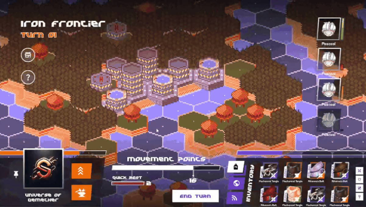
Unified Hub: The World Map became the single point of access to missions, inventory, helpers, and the character sheet. This prevented novices from searching through hidden submenus.

Progressive Simplification: Optional filters let novices hide advanced data, focusing only on essentials like available missions and active characters.
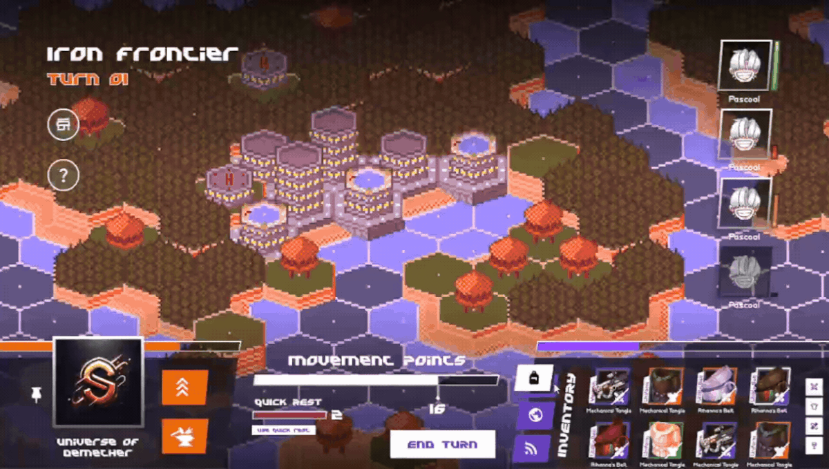
Scalable Depth: Experts could pin/unpin panels to keep advanced stats visible, creating a personalized balance between clarity and control.

Novices: “I could focus only on what mattered without being lost in the menus.”
Experts: “I can keep all the data I need in one view without unnecessary clicks.”
Outcome: 20% reduction in hesitation on mission selection and 30% fewer navigation errors during usability tests.
Simplifying Complexity
The Character Sheet
This was the single biggest source of friction — novices drowned in information, while veterans felt slowed by inefficiency.
Progressive Disclosure: Only essential stats and core abilities are shown upfront. Advanced modifiers, weapon attributes, and secondary systems are revealed in expandable sections.
.png)
Cognitive Relief for Novices: Instead of forcing players to read a manual, icons, tooltips, and animated transitions contextualized each skill directly in the interface also players could switch between 2D static portraits and animated models, letting them balance immersion and performance..

Efficiency for Experts: Quick-access shortcuts allowed veterans to configure equipment and weapon attributes with fewer clicks.

Setting the Stage
Making Progress Visible
After missions, players didn’t understand what they had gained or lost.
Victory Screen introduced celebratory visuals with XP and resources clearly surfaced.
.png)
Battle Report was adaptive, explaining how each mission affected the broader world, designed especially for novices to connect short-term actions to long-term impact.

Try Again Screen polished the defeat experience with a shattered glass animation, making failure feedback as engaging as victory.
Impact & Results
Outcomes That Matter
Our redesign was not just aesthetic, it produced measurable improvements in both novice onboarding and expert efficiency. By validating prototypes with new playtest sessions, we quantified the difference between the old and new experiences.
.png)
Reduced Novice Dropout
25%
9%
Dropout in onboarding.
42%
better then expected (32%)
Average hesitation time decreased
.png)
"This time I didn’t need the guide — I knew where to go."
Improved Information Clarity
In usability validation, novices no longer relied on manuals or repeated questions to progress.
Higher confidence self-reported in post-test interviews.
Fewer doubts and interruptions around skills/attributes.
"The sheet finally feels like it explains itself."
Faster Expert Workflows
In usability validation, novices no longer relied on manuals or repeated questions to progress.
Setup was faster and required fewer interactions.
Efficiency was highlighted as a key improvement:
less time in menus, more time in strategy.
“I can set up my team without fighting the menus.”
Clearer Feedback Loops
Failure and progression were reframed as clarity, not confusion.
3/10
8/10
Players correctly explained mission outcomes
40%
65%
Engagement after defeat increased
“Even when I lost, I understood what happened and wanted to try again.