Adding Pricing Intelligence to a
Leading Revenue Management Platform
ROLE
UX/UI Designer
TIMELINE
2025

From Intuition to Intelligence
In 2025, hotel revenue management was still a process of trial and error. Critical pricing decisions depended on a sharp intuition and static spreadsheets, turning the response to market dynamics into a manual and exhausting battle. Each day, managers spent hours on analysis, navigating a sea of data without a clear compass, unable to visualize the true impact of their decisions. Something fundamental was missing: a tool that could translate raw data into strategic intelligence.
I was part of an ambitious project to change that reality, creating the Pricing Simullator, a product that not only allowed for pricing simulation, but also provided deep insights, empowering managers to make decisions with speed and confidence, and to proactively dominate the market.
To comply with my non-disclosure agreement, I have omitted and obfuscated confidential information in this case study.
Building the Future of Pricing
Elevating Revenue Management
Our goal for this project was to move beyond the limitations of static data and create a foundation for strategic business intelligence. The original process was manual and fragmented, but we weren't just trying to make it digital. Our ambition was to build a powerful tool that embraced the complexities of the market and empowered managers to make smarter, more confident decisions.
Make the simulation process fast and intuitive for managers everywhere.
HIGH-LEVEL
GOALS
Give users more control over their data and analysis.
Create a platform for innovation and deeper business engagement.
My Role
I worked as one of three UX/UI Designers on this project, from the initial concept phase through prototyping and user testing. I focused on the design of the Pricing Simulator and its core features, collaborating closely with a team of developers and stakeholders to ensure a seamless and viable implementation.
The Proccess
The Battle Against Static Data
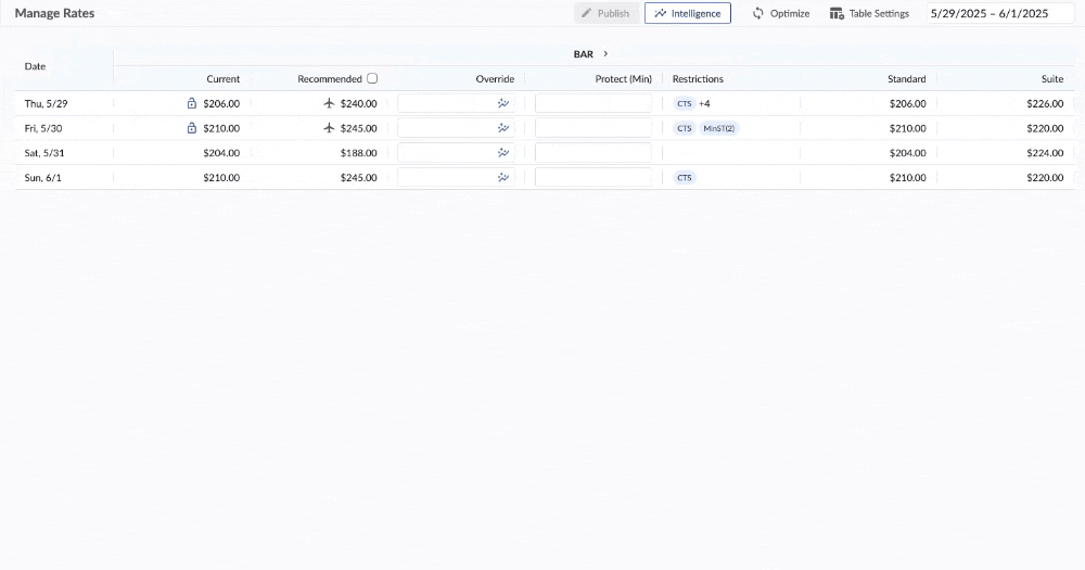
The process of hotel pricing was a manual and exhaustive battle against static data. Revenue managers, lacking a visual tool, were dependent on complex spreadsheets and cold reports to make decisions. Every attempt to simulate future scenarios was a time-consuming and error-prone exercise, requiring manual adjustments and comparing numbers across different columns.
What was missing wasn't the information, but the ability to manipulate it in a fluid and visual way. The analysis became fragmented, and this inefficiency was a bottleneck that prevented a swift response to market changes. The team needed a solution that would transform this mountain of data into a cohesive and interactive experience, where managers could "see" the impact of their decisions in real time, not just calculate it.
The First Iteration: The Pricing Simulator
To solve the problem of a lack of a visual tool, our team dove into a design process focused on research and validation. Based on data from initial interviews, we immersed ourselves in understanding the behavior and mindset of managers. Our main hypothesis was that by giving the user a visual tool to simulate price, they would gain a better understanding of market dynamics.
From there, our mission was clear: understand where to fit this information and how it could behave in an interface. With the hypothesis in hand, we moved on to the first iteration of the product: the Pricing Simulator. Our first version was conceived with a single chart.

The idea was for the user to simulate a price and see its causes and consequences during several "stay dates," with all the results presented simply and directly. The user could switch the metric displayed on the chart, allowing them to simulate prices and analyze the impact on variables like bookings and revenue.This first iteration was a fundamental step, validating the concept that data could be visualized interactively. It provided the basis for our next step: understanding the limitations of this initial solution.
From Data Analysis to a Modular Solution
After validating the initial concept, the next step was to understand the limitations of the first iteration. We dove into a series of usability tests to observe how managers interacted with our single-chart simulator.
It was during this research that we identified the main user pain point and the need for a strategic pivot. We observed that, although the simulator was intuitive, it was still limited.
3/8
Participants frequently expressed frustration at having to switch the chart to analyze different metrics in a short period of time.
This confirmed our hypothesis that the analysis, even if visual, was still fragmented. From this insight, we gained the clarity for a new path. The solution wasn't to improve the single chart, but to redefine the analysis experience. We proposed creating a layout with four simultaneous charts on the screen, giving users the ability to choose which metrics to display on each, allowing for a much richer comparison and analysis.

This new vision was an immediate success in testing. We implemented a prototype with this approach and measured the impact on two fronts: efficiency and confidence. The results were impressive:
42%
Reduction time spent on data analysis because of the ability to visualize four metrics at once.
68%
Increase in confidence when making pricing decisions because of the new interface.
A New Problem
The Prototyping Revolution with AI
With the problem clearly defined and the insights in hand, the next challenge was prototyping. Manual prototyping consumed days of work, making iteration a bottleneck. Complex charts and all their dynamic interactions demanded time we simply did not have, and this slowness in production prevented us from thoroughly testing all our ideas.
It was at this moment that I initiated an in-depth search for new AI tools. My initiative to explore the potential of generative AI led us to discover Figma Make, which became a true partner on our journey. The inclusion of Make in our workflow was a revolution. Where before we took days to prototype all the interaction possibilities on a single screen, we now created complex, interactive prototypes in hours.
The prototype below was created entirely in Figma Make using Cloud Sonnet.
60%
Increased our productivity, All the prototypes for usability testing were now made with Figma Make, increasing our output exponentially and allowing us to explore every nuance of the design much faster.
From a Limitation to a New Opportunity
One of the biggest challenges of the project came from an idea that seemed promising but proved unviable: the "Bookmarks" feature. The initial concept was to allow users to save simulation scenarios and, through an AI, have the system generate insights on what worked or did not work in the past. The concept was ambitious and would have transformed the platform into a "business memory" tool.
However, in discussions with stakeholders and the development team, it became clear that the high cost and technical complexity of training an AI for this purpose were insurmountable barriers for the first version of the product. The lack of clarity on ROI and the high technical complexity forced the team to make a difficult decision: to archive the idea.
This decision, however, was not an end, but a turning point. Instead of abandoning the concept of scenario comparison and analysis, the team reformulated it. What we wanted with "Bookmarks" was to help the user make smarter decisions, and we realized that comparison was at the core of that need. That's how the idea for a new feature was born, one that would become a key differentiator: the visualization of competitors.
From Simulation to Competitive Intelligence
The Competitors' Challenge
Even after improving the simulator, we noticed an "invisible enemy": the lack of competitor data in the simulation. In the hotel sector, the ability to price rooms based on competitor rates is fundamental to optimizing revenue. The absence of these nuances in the chart made simulations incomplete, as they did not reflect market reality.
From our tests and observations, the need to validate the product not only in isolated scenarios, but also against the market's giants, became clear. The challenge was monumental:
How to represent competitors in an already limited space, which contained a slider and four charts, without overwhelming the user?
We started a new round of research to understand the best way to represent this data, aiming to create a single visualization of all the "rates" that made up the chart, facilitating comparison. The biggest limitation of this process was determining the ideal number of competitors to display. This lack of clarity led to another round of research, which resulted in us narrowing the number down to just four key competitors.
This decision proved crucial. With a small but impactful number, we were able to add the data directly into the slider, enabling an instant visualization of how the user's prices compared to their competitors. This solution transformed the simulator from an internal tool into a competitive intelligence platform, proving that, sometimes, less is more.
A Visual Analysis Ecossytem
Simulator to Intelligence
Our strategic pivot, to abandon the bookmarks idea, led us to the challenge of how to represent competitors. The solution to this challenge was the turning point. Instead of creating a separate feature for market data, we integrated competitor prices directly into the slider. This allowed for a single, instantaneous visualization of all the "rates" that made up the chart, making comparison easy.
The final product became an ecosystem. The layout of four simultaneous charts gave the manager the ability to perform a detailed and in-depth analysis. And the slider, with the visualization of competitor prices, provided the necessary market context for each simulation to be strategic. Together, these two solutions transformed the product into something that went beyond a simulation.
That's why the project name evolved from Pricing Simulator to Pricing Intelligence. The change reflected that our platform had ceased to be merely a calculation tool and had become a hub of analysis that empowers users to make decisions with intelligence and confidence.