Adding Pricing Intelligence to a
Leading Revenue Management Platform
ROLE
UX/UI Designer
TIMELINE
2025

TL;DR
This case explores how I worked on the evolution of a pricing simulation experience into a decision-support tool for revenue managers.
The project started with a core problem: users needed to simulate pricing decisions, compare different business metrics, and understand the impact of manual overrides without relying on fragmented spreadsheets or static reports.
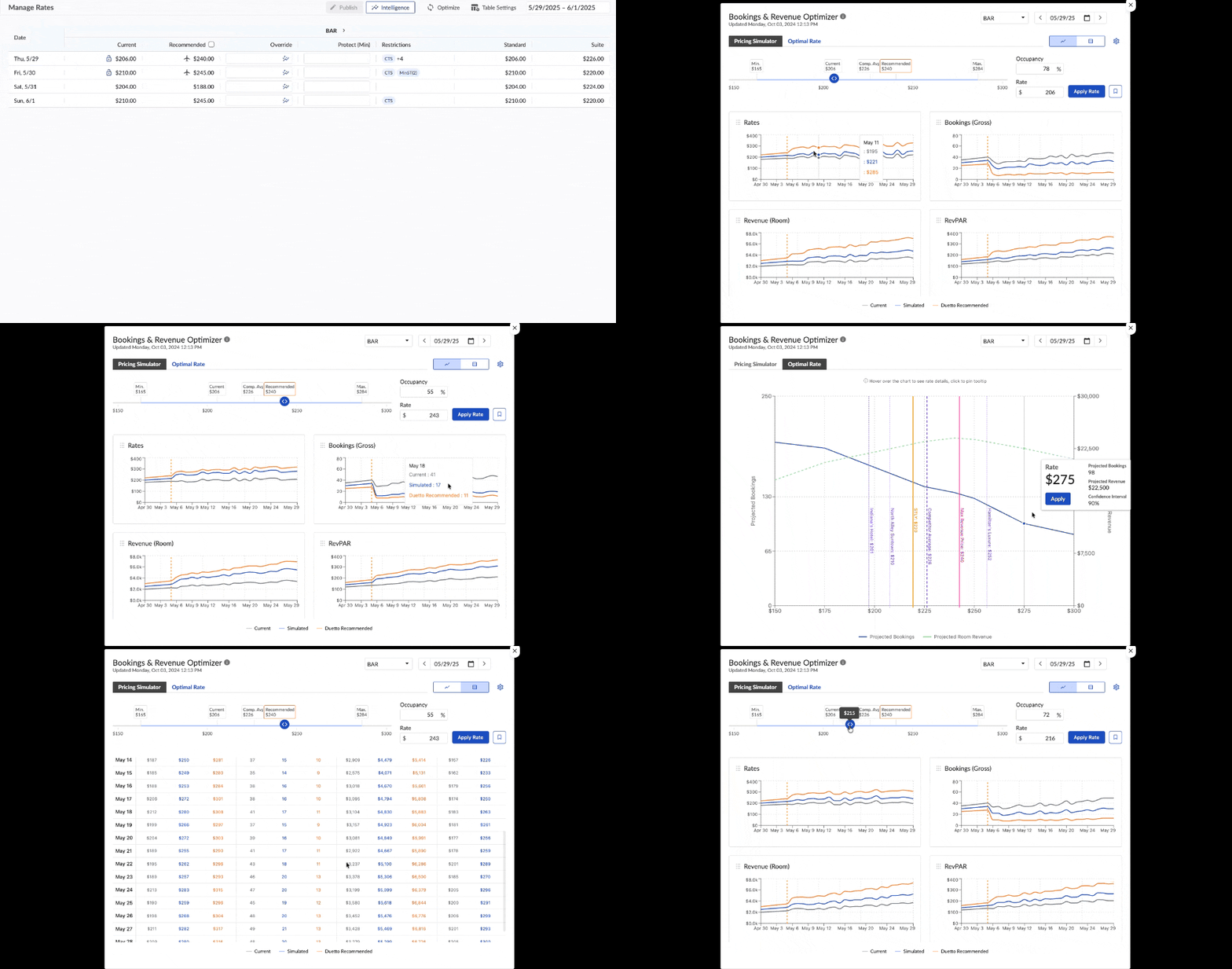
As one of three UX/UI Designers, I focused on the Pricing Simulator experience, helping translate dense revenue management data into interactive workflows, dashboards, and comparison models. The solution evolved from a single-chart simulator into a four-chart analysis layout, later incorporating competitor rates directly into the pricing slider to support faster and more contextual decision-making.
During usability testing with eight Manage Raters, the four-chart model contributed to a 42% improvement in data analysis efficiency and a 68% increase in decision confidence.
From Intuition to Intelligence
In 2025, hotel revenue management still relied heavily on fragmented data, static reports, and manual comparison between pricing scenarios. Revenue managers had access to information, but the process of turning that information into confident pricing decisions was slow, repetitive, and difficult to visualize.
I was part of a project created to improve that experience through a Pricing Simulator. The goal was not only to let users simulate price changes, but to help them understand the relationship between manual overrides, projected business impact, bookings, revenue, and market context.
To comply with my non-disclosure agreement, I have omitted and obfuscated confidential information in this case study.
BUILIDING A MORE VISUAL PRICE WORKFLOW
Elevating Revenue Management
The goal was to move beyond static analysis and create a more visual, interactive foundation for revenue management decisions.
The original process was manual and fragmented, but the objective was not simply to digitize it. The team needed a tool that could support comparison, scenario exploration, and clearer decision-making within a complex pricing environment.
Make pricing simulation faster and easier to interpret.
HIGH-LEVEL
GOALS
Give users more control over pricing scenarios and metric comparison.
Create a foundation for deeper analysis, business context, and future product evolution.
My Role
I worked as one of three UX/UI Designers on this project, from early concept exploration to prototyping and usability testing.
My focus was the Pricing Simulator experience, including user flows, high-fidelity interface exploration, chart behavior, interaction patterns, and prototype validation. I collaborated closely with developers and stakeholders to align the experience with business goals, technical constraints, and implementation feasibility.

THE PROCCESS
The Problem with Static Pricing Data
The pricing workflow depended on fragmented analysis. Revenue managers had to compare complex spreadsheets, reports, and manual adjustments to understand how a price change could affect future scenarios.
The information existed, but it was difficult to manipulate visually. Every simulation required users to move between numbers, columns, and assumptions, making the process slower and more error-prone.
What was missing was not more data, but a more interactive way to compare it. The opportunity was to transform dense pricing information into a visual experience where managers could simulate changes and understand their impact more quickly.
THE FIRST ITERATION
The Pricing Simulator

To address the lack of a visual simulation tool, the first iteration focused on a single-chart Pricing Simulator.
Based on initial research and interviews, our hypothesis was that a visual tool would help users better understand the relationship between price changes and business impact. The challenge was to define where this information should live, how it should behave, and how much context the user needed during simulation.
The first version allowed users to simulate a price and analyze its impact across multiple stay dates. Users could switch the metric displayed in the chart, comparing variables such as bookings and revenue.
This validated the core concept: pricing data could become more understandable when users could interact with it visually.
From Data Analysis to a Modular Solution
After validating the initial concept, the next step was to understand the limitations of the first iteration. We dove into a series of usability tests to observe how managers interacted with our single-chart simulator.
It was during this research that we identified the main user pain point and the need for a strategic pivot. We observed that, although the simulator was intuitive, it was still limited.
3/8
Participants frequently expressed frustration at having to switch the chart to analyze different metrics in a short period of time.
This insight changed the direction of the solution. Instead of improving the single chart, we proposed a modular layout with four simultaneous charts, allowing users to choose which metrics to display and compare them side by side.

The four-chart model improved the experience on two fronts: analysis efficiency and decision confidence.
42%
Reduction time spent on data analysis because of the ability to visualize four metrics at once.
68%
Increase in confidence when making pricing decisions because of the new interface.
A NEW PROBLEM
Accelerating Prototyping with AI
With the core problem defined and the four-chart direction validated, the next challenge was prototyping.
Manual prototyping was becoming a bottleneck. The simulator required complex chart behaviors, dynamic interactions, and multiple scenario variations, which made each iteration time-consuming to build and test.
At this point, I started exploring generative AI tools to accelerate prototyping. Figma Make, using Claude Sonnet, allowed us to create interactive prototypes faster and test more variations of the simulator experience.
What previously required days of manual prototyping could now be explored in hours, increasing our output and allowing the team to validate more interaction possibilities.
60%
Increased our productivity, All the prototypes for usability testing were now made with Figma Make, increasing our output exponentially and allowing us to explore every nuance of the design much faster.
From a Limitation to a New Opportunity
One of the biggest product challenges came from a promising idea that proved too complex for the first version: Bookmarks.
The initial concept allowed users to save simulation scenarios and use AI to generate insights about what had worked in the past. The idea was valuable, but discussions with stakeholders and developers showed that the technical complexity, cost, and unclear ROI made it unrealistic for the MVP.
Instead of treating this as a dead end, the team reframed the opportunity. The core value behind Bookmarks was not the act of saving a scenario, but helping users compare decisions and understand performance over time.
That reframing led to a more feasible direction: bringing competitor rates into the simulator experience.
From Simulation to Competitive Intelligence
The Competitors' Challenge
Even after improving the simulator, one important layer was still missing: competitor context.
In hotel revenue management, pricing decisions are strongly influenced by market rates. Without competitor data, simulations were still incomplete because they did not fully reflect the environment in which decisions would be made. The design challenge was clear:
How could we represent competitor rates inside an already dense interface, with a pricing slider and four charts, without overwhelming the user?
Through another round of exploration and research, we narrowed the display to four key competitors. This allowed competitor prices to be integrated directly into the slider, creating a compact comparison layer without adding a separate feature or increasing visual complexity.
A VISUAL ANALYSIS SYSTEM
Simulator to Intelligence
The decision to move away from Bookmarks led to a stronger direction: integrating market context directly into the simulator.
Instead of creating a separate feature for competitor data, we incorporated competitor prices into the pricing slider. This allowed users to compare their price, recommended rates, and competitor rates in one place.
Together, the four-chart layout and competitor-aware slider changed the role of the product. It was no longer just a simulation tool. It became a decision-support experience that helped revenue managers analyze business impact and market context in the same workflow.
That is why the project evolved from Pricing Simulator to Pricing Intelligence. The name reflected a shift from calculation to comparison, interpretation, and more confident pricing decisions.